
BEHIND THE BRANDING
With the start of the new year I wanted to give BRAWSCOTLAND a new, fresh and more stylized look. I went back to the drawing board over the last couple of weeks and in this blog I will give you some in-depth information about the logo, the meaning behind it and how things took shape.
THE START
When I visited Scotland for the very first time in the summer of 2019, I had the occasion to take a little tour through the country. After we had a beautiful drive through places such as Loch Lomond & The Trossachs, Inveraray and the lovely coastal town of Oban, the drive continued through the iconic steep-sided valley of Glen Coe. Coming from a Low-Country and being a big enthusiast of hills and mountains, this was a jaw-dropping experience for me. At the end (or the start) of the valley there is this stunning pyramidal peak of Buachaille Etive Mor; the Stob Dearg which stands boldly guarding the entrance of the world-famous Glen.
The weather took a turn for the worse and visibility was poor, so unfortunately I couldn’t get a good image that day. Six months later, having relocated to Scotland, I had a second try capturing this iconic mountain on a return trip from Inverness.
It was a bit of a snowy day, not much, but enough to sugar coat the summit and highest peak of the Buachaille Etive Mor, providing a contrasting moody scene. I got the image I was looking for, and when I decided to start an Instagram account named BRAWSCOTLAND to capture all that braw scenery I’d encounter during my travels through Scotland, it was an easy choice for me to use this image as my profile picture along with the brand name and saltire embedded in the image. If you are interested how BRAWSCOTLAND got its name you can read it here in the about section.
THE DESIGN
This robust distinguished mountain peak represents the strong, unrivalled and wild beauty Scotland has to offer, so I wanted to implement the mountain in some form in the new design of the logo.
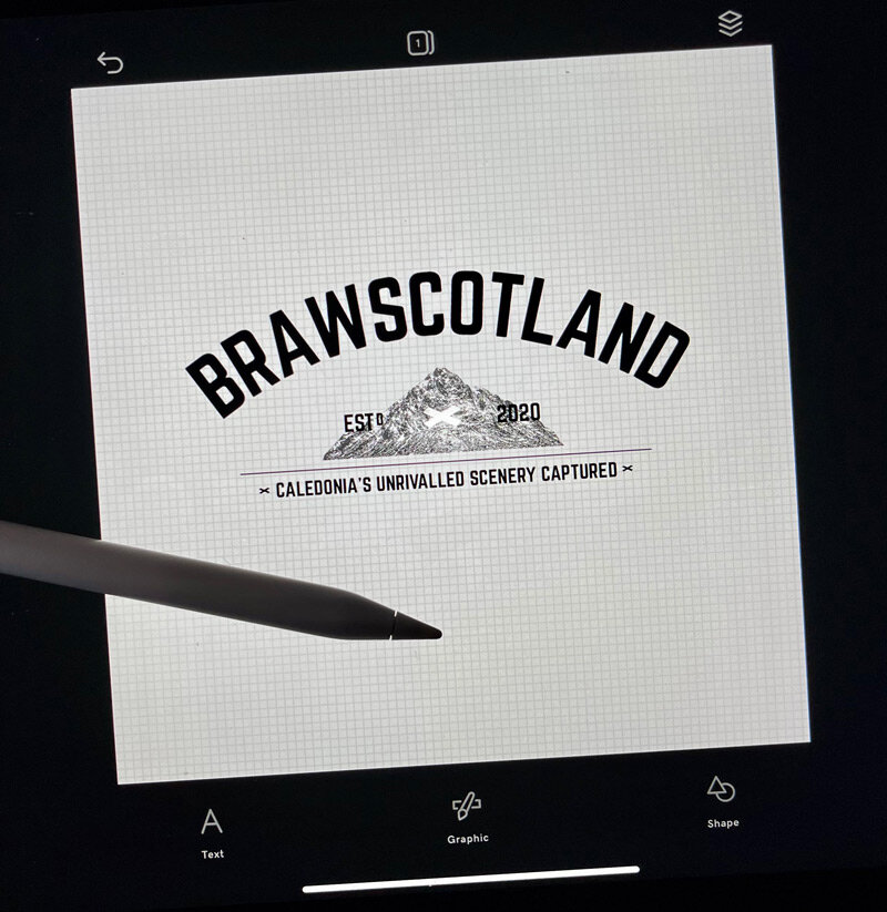
I started off with the bold brand name I already had from the previous logo and searched for a font that had more of a classic feel. The brand name is slightly curved which functions as a protecting shield above the logo’s element.
When I was working out my first idea for the mountain I used the original photo I took from the mountain peak and edited it in Photoshop so that it looked like a drawing. The idea that I could use a photo I took myself for my logo sounded great in the beginning, but I wasn’t happy how it turned out. Whatever I did, the mountain kept reminding me of a logo of a well-known chocolate brand from Switzerland and I scrapped the idea of using the edited photo.
I needed to find another way to make this element work in the new logo.


Something I’ve really enjoyed doing since I was little is browsing through a big world atlas. I remember my gran had an old version alongside a big road atlas and we always looked in it together to do some preliminary research for our holiday destinations. Seeing contour lines in a topographic map always made me excited to see that we were going to a destination where there might be some hills or mountains.
With that fond memory in mind, I now opened up the digital atlas and looked for the contour lines of Stob Dearg. Normally I would prefer more symmetry, but the organic shapes in this element represent more of the things than can be found in nature which I like to photograph. I feel the organic shape from the contour lines adds some visual interest despite its lack of symmetry. With some imagination I can see the shape of the Netherlands in it, as well as the Flevopolder, the world's largest artificial island created by land reclamation found in the Dutch Province of Flevoland.
All of this resonated with me so I started to draw the contour lines for one of Scotland’s most loved Munro peaks as the element for my new logo.
Below you can find the similarities of the shapes.
Map of the Netherlands
A closer look to the centre of the Netherlands. The Flevopolder, the world's largest artificial island created by land reclamation found in the Dutch Province Flevoland. A shape I find similar to the contour lines of the summit of Buachaille Etive Mor.
Contour lines from the Stob Dearg; The summit of the Buachaille Etive Mor.

The contour lines of the Stob Dearg, the summit of the Buachaille Etive Mor. Used as an element in the logo.
The Scottish saltire transfers from the old logo to the new one and takes its place in the heart of the contour lines from the Stob Dearg and functions as the summit.
The tagline underneath reinforces the brand's identity.
Thank you so much for reading. I hope you like the new logo and the meaning behind it. Let me know in the comments what you think.